Color is not decoration; it is context. In the Netherlands, it shapes streetscapes, preserves heritage, and lifts resale value. This guide explains window frame color trends Netherlands, how Dutch door colors evolve, and which popular window hues NL work with brick, climate, and regulation. Use it to choose contemporary color choices windows and doors Netherlands that look good now and age gracefully.
Basic concepts
- RAL/NCS codes: Standardized color systems used by Dutch manufacturers and municipalities. Specify codes to avoid surprises.
- LRV (Light Reflectance Value): Higher LRV reflects more light and heat; lower LRV absorbs. In sunny rooms, higher LRV reduces overheating and glare.
- Finish: Matte hides imperfections; satin is the balanced default; gloss highlights details but shows wear.
- Substrate: Timber, uPVC, and aluminum accept color differently. Factor factory coatings and maintenance cycles.
What drives color in the Dutch context
- Brick and roof tones: Dutch brick ranges from warm red to cool brown. Choose contrast for crisp edges or tonal harmony for calm facades.
- Climate: Coastal UV, wind, and salt fade dark pigments faster. Rain and sand mark high-gloss surfaces.
- Regulation: Monuments and protected streets often require traditional schemes. Apartments with an VvE typically enforce uniformity.
- Light: Low winter sun and overcast skies flatten colors. Muted hues read richer outdoors than on a screen.
Current top trends in NL windows and doors
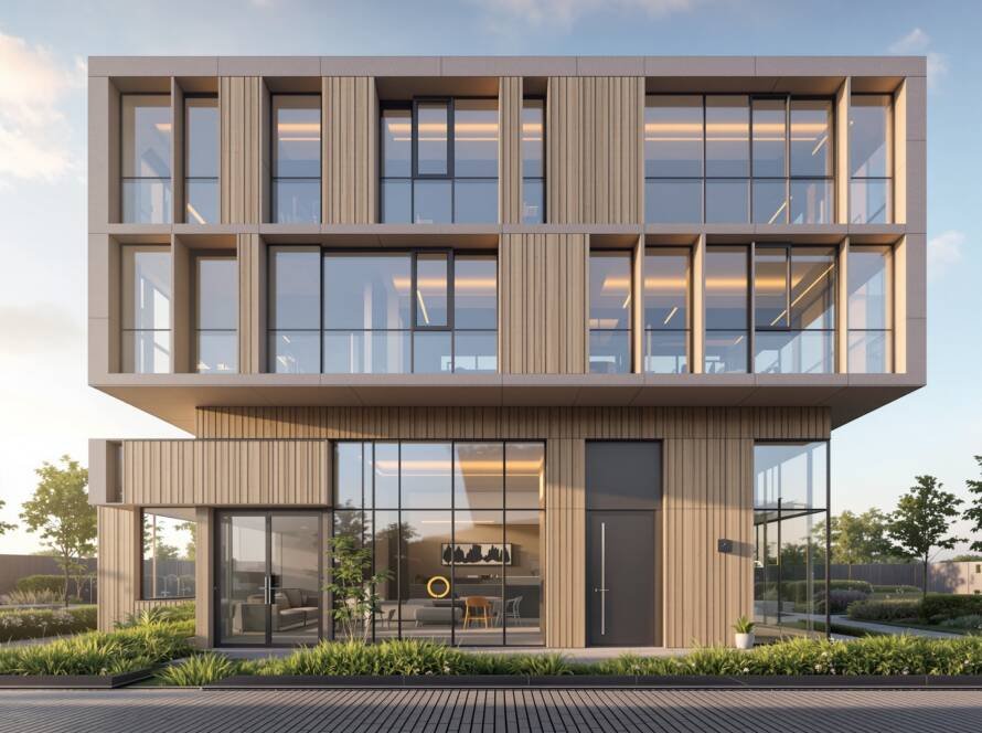
- Anthracite and near-black frames: RAL 7016 and soft black deliver sharp lines against red or yellow brick. Popular in new-builds and extensions.
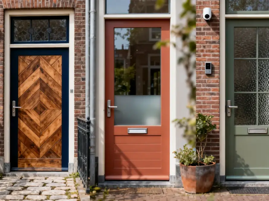
- Warm whites and off-whites: RAL 9010 and creamy tones pair well with oak floors and light interiors, a staple in door paint trends Netherlands.
- Muted greens: Sage, olive, and moss bring a biophilic accent; ideal for front doors on traditional terraces.
- Earthy clays and taupes: Greige and clay neutrals soften modern facades without looking cold.
- Two-tone schemes: Dark frames with a bold door, or pale frames with a deep door color, add hierarchy and wayfinding.
- Matte and textured coatings: Low-sheen finishes reduce glare and make contemporary details feel deliberate.
Match color to Dutch architecture
- Canal houses and monuments: Deep green, oxblood red, black, and off-white respect tradition. Keep muntins and trims coordinated.
- Post-war row houses: Anthracite frames with a saturated door (blue, green) upgrade curb appeal without clashing with brick.
- Contemporary builds: Black or bronze frames with warm neutral doors maintain a minimalist, durable palette.
- Rural homes: Mid-greens and natural timber tones sit well with thatch, brick, and landscape.
Materials and finish choices
- Timber: Takes any color; plan a 5–8 year repaint cycle depending on exposure. Use breathable, waterborne systems.
- uPVC: Choose factory foils or coatings rated for UV; darker colors need heat-stable substrates to avoid warping.
- Aluminum: Powder-coated RAL finishes excel in coastal zones; specify marine-grade where needed.
Sustainability and longevity
- Heat and expansion: Dark, low-LRV colors run hotter. On south and west facades, prefer mid-tones to reduce stress.
- Fading: Blues and reds fade faster near the coast. Greens and earth tones retain chroma longer.
- Circularity: Recoatable systems extend life; avoid colors that require aggressive sanding to refresh.
Regulations and streetscape
- Municipal guidance: In protected areas, color ranges can be prescribed. Verify before committing.
- VvE and HOAs: Align with building-wide color policies to keep harmony—and approvals.
Practical tips
- Anchor the palette to fixed elements: brick, roof tiles, gutters, and paving. Let these set warm or cool direction.
- Test large samples outdoors on north and south facades. Observe in morning, noon, and dusk light.
- Specify by code. Record RAL/NCS plus sheen level for repeatable results across windows and doors.
- Use contrast sparingly. Emphasize the front door; keep frames and sills unified to avoid visual noise.
- Plan for maintenance. Choose finishes with easy cleaning and predictable refresh cycles.
- Respect context. Mirror neighboring rhythms in tone, even when opting for contemporary color choices windows and doors Netherlands.
- Balance trend and timelessness. Pair a fashionable door hue with neutral frames to simplify future updates.
Conclusion
Choose color with the discipline you bring to structure. Start from brick and climate, filter through regulation, and land on a palette that reads clean in Dutch light. With awareness of window frame color trends Netherlands, Dutch door colors, and popular window hues NL, you will create a facade that feels current, coherent, and built to last—one decision that pays back every time you come home.